Tag Archives: luxury
Anatomy of a Maison – Australian Financial Review
Anatomy of a Maison
The Australian Financial Review | November 2011
In the Medieval age, the sight of a towering spire signalled a city of splendour. Today, it is cathedrals of retailing that indicate metropolitan status in the global pecking order. The December 3 opening, not of another Louis Vuitton store – there are already 460 of those worldwide – but of a much grander Louis Vuitton ‘Maison’ (of which there are just 13) proves Sydney must be a very smart town indeed. Kar-Hwa Ho is the man responsible for the latest Australian opening, as well as such landmark stores as Louis Vuitton Singapore, housed on its very own island. Vuitton’s design director for the Asia-Pacific region tells Marion Hume about the new maison in the company of the brand’s Paris-based director of architecture, David McNulty.
A CATHEDRAL FOR A SECULAR AGE
“Is that a compliment?” asks David McNulty. “I suppose fashion houses are becoming architectural theatre in the way opera houses were and cathedrals used to be. For us, there is always a question of visibility. We cannot be tucked away. We must be seen.” So how big a footprint is needed for a maison? “About 2000 square metres” says McNulty. Walk-ins are welcome at the Sydney Maison, because busy George Street means there’s nowhere to park, let alone a space for your limo to wait. But what of those Vuitton stores where you can’t walk in? The line at the Paris Champs Élysées flagship store often numbers in the hundreds. “It’s really not good to have people waiting,” protests McNulty, revealing that staff serve hot beverages to waiting crowds and the company sometimes lays on transport to the other five Vuitton stores in Paris, “but everyone wants to go to that one because it’s the biggest.”
IF WE BUILD IT, THEY WILL COME
To semaphore to the customer that a maison is more than just a place to pick up a monogram wallet, it helps if the building itself is jaw-droppingly attractive and the Sydney Maison certainly is chic. “But we don’t own the building, which means there are restrictions,” explains Ho. Even without these, sometimes the most arresting designs don’t get built. All the architecture models that didn’t make it are in the Vuitton head office, including one of shining metal rods by Zaha Hadid. “One day!” says Ho, wistfully. Do the challenges of preserving history lead to better stores? Not always. “While we’re not interested in destroying heritage buildings, our original concepts are usually better,” says McNulty, who adds that, sometimes, keeping the history can go too far. At the recently opened Milan Maison, he says, “there’s a really ugly mural on the wall. Really ugly. It has a preservation order on it so we built a wall in front of it, so some archaeologist in the future can come in and find it.”
MAKING AN ENTRANCE
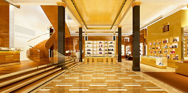
There is no grander gesture than empty space, given retail rents are charged by the (astronomical) square metre and here is 59 sq m of glittering floor over which you must walk to reach the central altar of retailing. Walking directly ahead, you enter a ‘fast lane’ leading to what is known as the ‘hot zone’. Here’s where you find the bag that stars in the latest advertising campaign. “The bags that are the ‘fashion moment’ can always be seen from the entrance to the store,” says McNulty. But does one turn left or right? “We don’t want to control that,” he says. “We want to convey to the visitor that there are many things on offer; leather goods, travel, the men’s universe, the women’s universe.”
FAMILIARITY BREEDS EXCITEMENT
The aim is to attract a customer who knows exactly what to expect yet is also in search of novel retail entertainment. Uniform across all Vuitton stores is a colour palette of caramel and toffee, a reference to the checkerboard Damier canvas of 1888, which in turn led to Louis’s son, Georges, inventing the famous monogram canvas of 1896. And, rather as a cathedral has a smaller, perhaps more opulent, altar behind the main one – this only visible to those allowed to venture behind a parclose – so too does the Sydney Maison have its hidden treasure: literally, given the watch and jewellery sales area is tucked behind the ground floor’s central selling station. “The aim is to create a more intimate area, away from the flow,” Ho says.
GOING UP
In all retailing, the challenge is to encourage traffic to upper floors. That’s been somewhat easier since 1857, when the first commercial passenger elevator was installed in a New York City department store. Yet the Sydney Maison has just one customer lift. “It’s not necessary to have more,” McNulty says. “What tends to happen is that people walk around and discover the store by themselves, including taking the stairs. A sweeping staircase – all steel substructure and timber veneer – is visible centre-left as you enter the Maison, inviting you to mount a stairway to heaven – or more precisely menswear first and then, on the second floor, ‘women’s universe’ for fabulous fashion by Marc Jacobs.
HOLLYWOOD GLAMOUR
As Gloria Swanson knew, one must be well lit. While the primary function of store lighting is to make sure you can see everything, at Vuitton, spotlights are trained on the hottest products just as kliegs were once directed on a movie star’s cheekbones. “Whenever we can bring natural light into the store, we do,” says McNulty, who adds that, despite a menu of lighting options, sales staff always choose the brightest setting. But in the ‘try rooms’ (this is Vuittonese for what you and I usually refer to as a fitting room), it is you who control the light, via a panel that allows you to check an outfit under the noonday sun, at twilight and by night.
DESIGN FOR MEN
Even in equal Australia, men rarely shop midweek, which risks a very empty floor. The solution: stick menswear on the first floor so women must go past it and thus might think, “I’ll get him a belt to soften the blow of all the stuff I’ve bought for me.” And when men do shop? “If a man sees a mannequin with an outfit on it, he could well buy the [lot],” says McNulty. Expect to see rows of mannequins. The primary male quest is for shoes. Your shoe guy wants to choose shoes, sit down, try them and buy them. So the chairs here (just one of 10 different designs in use by Vuitton) are the optimum height and tilt for trying on footwear. This is less of a concern in China where, “they have no problem waiting for a seat to be freed up; they’ll do it standing on one foot and they’ll even try clothes on without using a changing room,” McNulty says.
VIP
When spending a penny (as opposed to $4500 on the latest Tiger clutch bag), every customer is a VIP – given the VIP loo is for you. But there’s VIPs and VVIPs. Tucked into a corner of the second floor is an area code-named ‘constellation’, as in ‘star’. Here, those who require additional privacy can be accommodated behind a closed door. As for the old saying that common folk sweat, the rest of us perspire and stars glow, here’s why: the VVIP area has its own dedicated air con. It’s here that the most exclusive service – the chance to get a bag in shapes and leathers of your choice – will be offered. It’s called ‘haute maroquinerie’ in Vuittonese. ‘Hot maroc’ in Sydney-speak? Don’t say we didn’t warn you.
SECRET DOORS
While an exceptional sales associate cannot actually walk through walls, she can tap a mirror to reveal a door that allows her to reach the tills. Cash-and-wrap is hidden from your view, “although we have to make sure that this works well with the flow of the selling ceremony,” says Ho. “You don’t want your salesperson to disappear for too long with your things while you are sitting around waiting.” But what about disappearing with one’s credit card while, even in restaurants, they bring the machine to you these days? “Mostly, people don’t mind,” Ho says. “But in Asia, customers follow their salesperson to the till. People pay cash and need a secure area to count it.”
ECOLOGY
Everything is as ecological as possible, from the certified woods you can see to the basement unpacking area you can’t, where paper and cardboard are stored. “Our Guam store is powered by solar panels,” Ho says. This not an option for Sydney where the building is rented.
AUSTRALIANA
While big-brand stores look somewhat the same around the world, Vuitton makes the effort to help shoppers remember what country they are in. In Auckland, the store features model lambs created by a Kiwi. In Jakarta, there are Indonesian lamps and stools. So for Sydney? The eagle-eyed will spot eucalyptus motifs played out in wood marquetry. Coming soon – although not in time for the opening – LV monogrammed surfboards should provide a clue.
WINDOW ON A NEW WORLD
Windows are an invitation, and a global mega-brand requires lavish displays. “From our standpoint, that means providing the right space and lighting and access,” says McNulty. The secret to quick changes? Panels that can move in and out and doors big enough to accommodate a window dresser carrying a zebra. That is not a joke. The windows in London’s Bond Street currently feature a herd of life-sized African fauna.

